Be user-friendly, not you-friendly.
The “Would you like to fill out a survey?” Test
Have you ever seen someone on the street holding a clipboard and rushed over to them to see why they were stopping passersby? Me neither. More often than not, those people want something from you and you do not want anything from them. If they want people to stop and have those people be happy about being stopped, then they should offer some incentive (like free stuff) for stopping. Without an incentive, there’s not much reason to stop, from the passerby’s point of view. If you want to be user-friendly, it helps to adopt the user’s point of view and give that viewpoint priority over your own. Being user-friendly will often involve resisting the temptation to be you-friendly.
Here is an example of user-friendliness. When I am copying files from one place to another on my computer, I sometimes receive the following message:
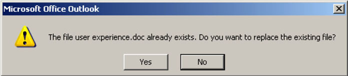
Here they have made the default answer “No” so that if I press the ‘Return’ key I will not copy over the existing file. By making “No” the default action, they are protecting me from doing something that I might not realize that I am doing and also might not want to do. They are looking out for me. I appreciate that. They could have built their program so that it just automatically replaced the existing file without asking me, “Are you sure?” But I bet that they would have gotten some complaints or heard the karmic grumbling if they had done that. So someone has spent some time putting in this extra step and spent some time reasoning that given what most users usually want to do and given the potential loss at stake, the default action should be “No”.
Contrast that with this example of user-unfriendliness. Recently, I changed over from the old Yahoo! Mail to the new Yahoo! Mail. Then, just for fun, I tried to switch back. Yahoo! didn’t take me back to the old Yahoo! Mail right away. First, I was presented with this dialog box:

Here they have made “Cancel” the default action even though there is nothing like an important file to be lost here, as there was in the previous example. There is nothing for me, as a user, to lose at all. So why did they do it? My guess is that they thought about what most users would want to do (go back to the old Yahoo! Mail), then thought about what they want most users to do (stay on the new Yahoo! Mail), and then decided to make the default action the action that aligned with their desires, not the users’.
I appreciate optimism as much as the next guy, but it’s wishful thinking on Yahoo!’s part to think that this bit of user-unfriendliness will make it any more likely that I will stay on the new Yahoo! Mail when I’ve just said that I want to go back to the old Yahoo! Mail.
If I’m not paying attention (or if I assume that Yahoo! has made the default action the action that the user is most likely to want), then I will hit the ‘Return’ key (which will press the “Cancel” button), the dialog box will disappear, and I will still be in the new Yahoo! Mail.
But what are the chances that after the dialog box closes and I find myself still in the new Yahoo! Mail program that I will feel any differently about the new version of Yahoo! Mail and decide to stay with the new version? Doesn’t it seem a little more likely that I will be momentarily confused, find the “Switch Back” link again, click it again, use a moment of my life to pay a little more attention to the options in the dialog box that pops up, click on what I want to do (“Switch to Yahoo! Mail Classic”) and be slightly annoyed at Yahoo! for being a little unfriendly to their users? After all, didn’t they just waste a moment of my time?