Be guessable.
The “Guessable” Test
If your visitors don’t have to guess much and when they do guess, their guesses are right, then your website passes The “Guessable” Test. There are several parts of The “Guessable” Test.
Guess: What is it?
The first type of guessing that a user might do is about what it is that they are seeing. Is that thing a button? Is it a link? Is it an item for sale? Is it an ad from another site? Is it a search result? Is it part of an article? Is it an icon? Is it clickable? Users shouldn’t have to spend any time at all figuring out what’s what on a user-friendly site. Make your buttons look like buttons, your links look like links, and your ducks look like ducks.
Guess: Where is it?
Ideally, no one will have to guess where anything is on your site. They will see all the signs and know exactly where to find what they’re looking for. They won’t go down the freezer aisle looking for the ketchup. They won’t bark up the apple tree for an orange. Ideally. In reality, many of us have to pull down a menu to see what’s there and then see that it’s not what we want, pull down another menu to see if what we want is there, and so on. One thing that helps in organizing your information and/or products is to create mutually exclusive categories, or to have multiple paths to the information/product if it naturally falls under two categories.
If you are looking for the book “The Cat in the Hat” and are confronted with the choice of “Books” or “DVDs”, then you will know where to look, because a product cannot be both a book and a DVD. However, if you are looking for the book “The Cat in the Hat” and are confronted with the choice of “Books” or “Gifts for Children”, then it is not clear completely clear where to look because the book “The Cat in the Hat” is both a book and gift for a child. If the book was on the site but not found under “Gifts for Children”, then some book buyers may have the unpleasant experience of not finding what they want on the first try. It seems reasonable to expect “Gifts for Children” to contain all possible gifts for children, including books.
Guess: Where am I? Where can I go? Where have I been?
Usability expert Jakob Nielsen says that, as part of good navigation, all websites should take measures to make these three things obvious to the user at all times: where they are, where they’ve been, and where they can go. Knowing where you are is comforting. Knowing where you have been will save you time in case you do (or don’t) want to go there again. Knowing where you can go will also save you time in case you do (or don’t) want to go to any of those possible places.
Guess: What will happen if I...?
Users should not perform an action and then be surprised at the result. They should never have to wonder, “What will happen if I do this…?” Users should not have to guess where they are going on the Information Highway, just as they do not have to guess where they are going on real highways. There are no signs that say, “To Las Vegas, Maybe” or “To San Diego, with 90% Certainty” because 90% certainty isn’t good enough. Users and drivers should be 100% certain of where the roads will take them before they get on them. On the Information Highway, the roads are buttons and links. Website makers should make their buttons and links such that their visitors are 100% certain of what will happen if they click a particular button or link. Remember multiple choice tests? Guessing is the last resort.
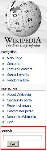
Here’s part of Wikipedia:
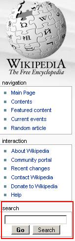
Look at what I outlined in red. The search box on Wikipedia is followed by two buttons. One says “Go” and the other says “Search”. If I were from out of town or were a first-time visitor to this site, I think I might find this confusing. It’s a search box and I want to search for something. Both “Go” and “Search” sound like they will start looking for my search item and I’m not sure what the difference is. The “Go” button is bold, so maybe that’s what I ought to click. I don’t know. It’s common for sites to have a “Go” button OR a “Search” button after a search box, but not so common to have both. I’m not really sure what will happen. Let us see.
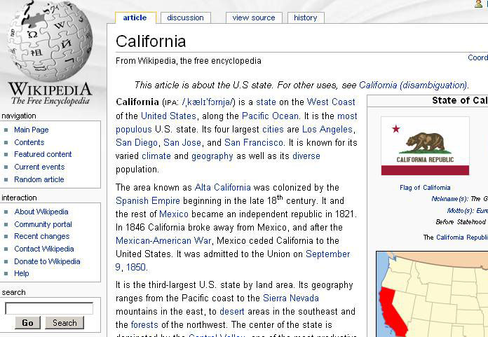
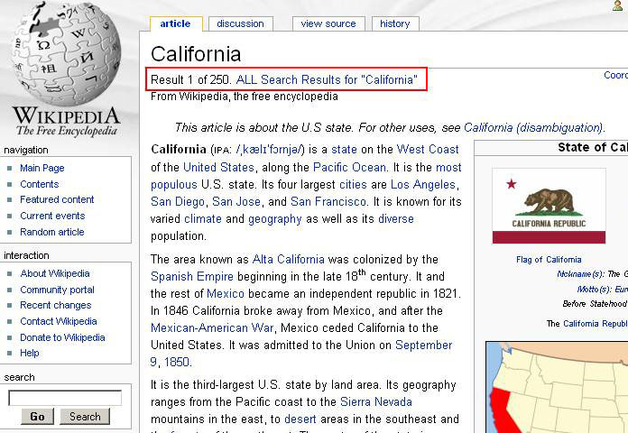
If I enter “California” and click the “Go” button, then I end up on a page about California:
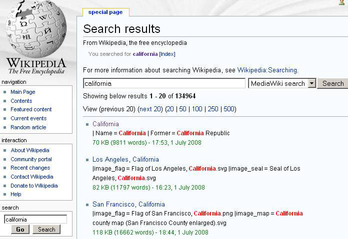
If I enter “California” and click the “Search” button, then I end up on a page of search results for “California”.
Okay, so the two buttons do do two different things, and now we know what they do. The problem is that we had to go down those roads to see where they led. We should not have had to do that. It should be immediately obvious to visitors what will happen if they click on the “Go” button and what will happen if they click the “Search” button BEFORE they click on either button. Every driver knows what will happen if they get on a road to “Los Angeles”. The Information Highway should be just as easy to navigate as real highways. The path to a single page and the path to a list of search results should be just as well marked as the road to Los Angeles or the road to San Francisco.
In this case, I would not have two buttons. The user’s goal is probably to get to a page about California. It seems unlikely that they will know beforehand that the search result that they want will not be the top one, so I would have the one button take them directly to the top result page and then on that page I would have a link that leads to the rest of the search results.
So the search box would look like this:
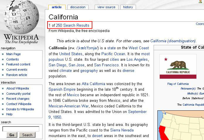
And that would take you to the top result page, which would look like this:
Or this:
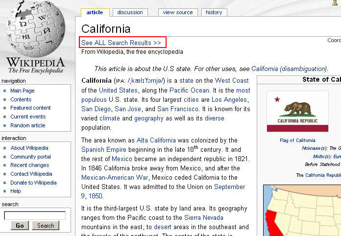
Or this:
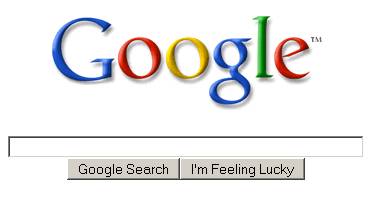
Google does the same thing and I’d be willing to bet that first-time visitors are not 100% certain what clicking the “I’m Feeling Lucky” button will do.
Guess: What’s in the dropdown menu?
As with buttons and links, you should also try to make it clear what type of content a dropdown menu contains before the user clicks on the dropdown menu. I don’t mean that the user must know what all of the options in the menu will be, just that the user will know what types of options will be in the menu.
Here’s a dropdown on Amazon:
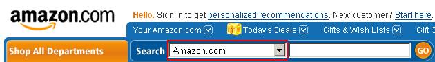
What would you expect the other options in this dropdown to be?
It should be filled with things that contrast with “Amazon.com”. I think of “AnotherCompany.com” and “The Entire Web” as things that contrast with “Amazon.com”. Part of why it’s not completely clear what will be under this dropdown is that some sites give their users the option to search just the current site or the entire Web.
This is what’s actually in the dropdown:
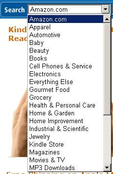
So what’s actually in the dropdown is the various departments of Amazon.com. Since this is the case, it should say “Entire Site” or “All Departments” or “All of Amazon.com” instead of “Amazon.com”.
If it said “Entire Site”, then I would expect to see things that contrast with “Entire Site” in the dropdown. And what comes to mind are things that are only part of the site, like “Electronics”.
If you look at the dropdown more closely, you will see one category that is oddly placed.
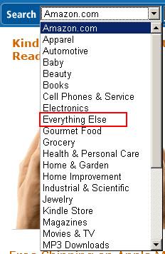
“Everything Else” is a fine option to have in the list, but it should not be alphabetized under “E” for the same reason that “None of the above” should not be alphabetized under “N”. “Everything Else” should be at the very bottom.
“Everything Else” doesn’t even really make sense during the Es before you’ve seen all of the options.
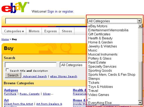
eBay gets it right on both counts:
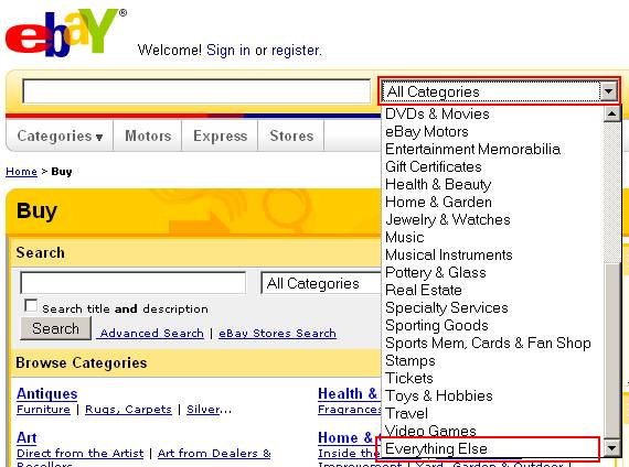
eBay’s dropdown has the text “All Categories” in it. It’s easy to predict that if you click on the dropdown you will see some subset of all the categories, either smaller groups of categories or individual categories.
And eBay has placed the “Everything Else” option at the very bottom of the list, where it makes sense.
One last thing that I might do is separate it from the other options by putting some dashes in the line above it, because it’s not quite like all the other options. Then it would look like this: