Usability Review of Yodlee’s Corporate Website
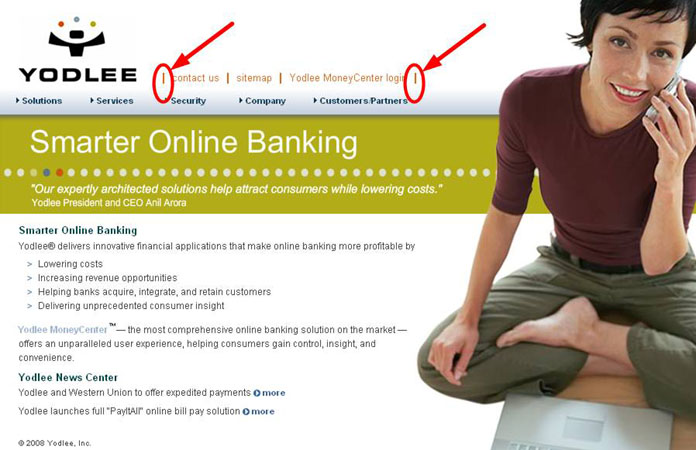
1. The lines bewteen the links are necessary to separate the links, but these lines on the outside of the links are unnecessary.
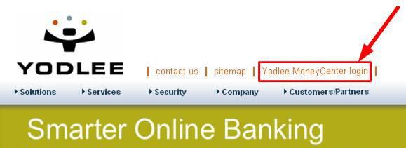
2. ‘Login’ is the most important word in this phrase. It should be moved to the front of the phrase, so that it is ‘Login to Yodlee MoneyCenter’ and the user knows from the very first word what kind of thing they’re looking at.
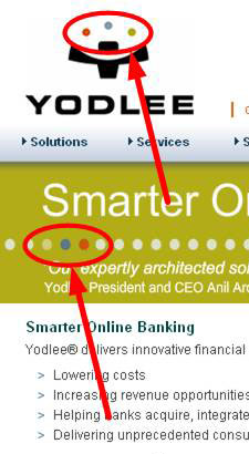
3. These dots are the same colors but they are reversed on the lower set. Why are they reversed?
4. These two lines are competing with each other to be read because they are both left-aligned. Since the bottom line is less important, I would right-align the bottom one.

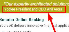
5. I would also reword this phrase so that it says, “Anil Arora, President and CEO of Yodlee”.
6. Links should have a unique visual presentation. Section headings and other non-link words should not look like links, as they do here.
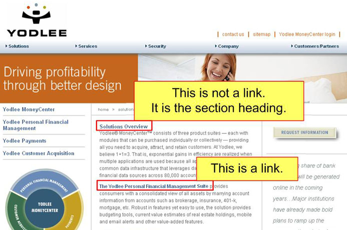
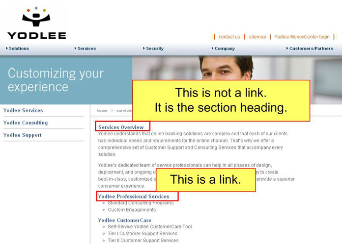
7. Same issue below, but here the links look even more like headings.
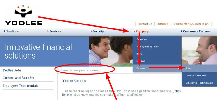
8. From the top navigation bar, I chose ‘Company’ and then ‘Overview’ but the ‘Company’ tab in the main navigation does not look any different from the other tabs, nor does the ‘Overview’ line in the sub-navigation look any different from the other sections under ‘Company’. I have no sense of where I am apart from the breadcrumbs.
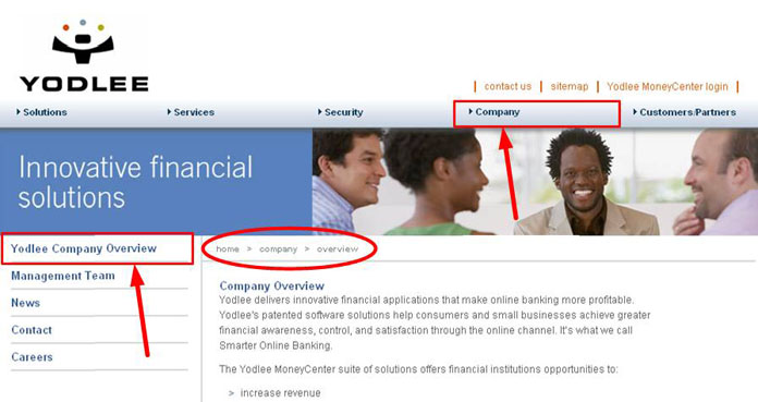
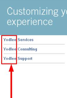
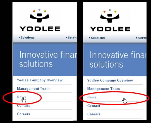
9. The word ‘Yodlee’ is overused here. If it is used too often, it will become meaningless and distracting. Compare the navigation on the left with the navigation on the right. The one on the right easier to use. It would be harder to find what you want if it said, “Yodlee Management Team, Yodlee News, Yodlee Contact, and Yodlee Careers.”

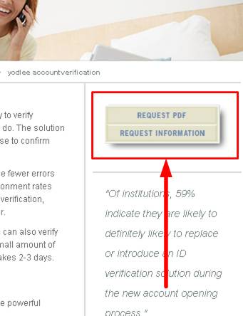
10. If these are supposed to be two different buttons, they don’t look like two different buttons, and they lead to the same place.
11. The spacing of the top navigation looks slightly uneven. Spaces 1, 2, and 3 look fine but 4 looks like it might be a little wider and 5 looks like it might be slightly narrower.

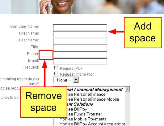
12. I would add more vertical space between the fields and remove some of the horizontal space between the field labels and the fields.
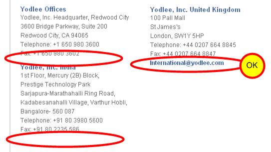
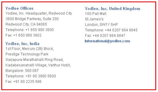
13. Every office location should have an email address.
14. I would change this:
To this:
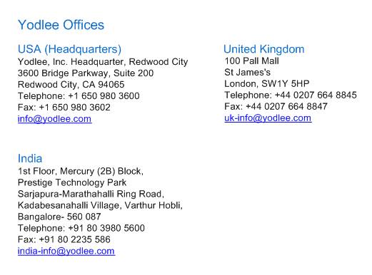
Changes:
- I removed ‘Yodlee’ from every location name and put it in a header.
- I made sure each office location has an email address.
- I changed the blue of the location name so that it’s not the same blue as the email link.
- I put ‘Headquarters’ in the appropriate location name.
15. These look an awful lot like buttons but they’re not buttons.

16. These labels should have the same words because one is where you’re going and the other is where you end up. Either both should be ‘Overview’ or both should be ‘Yodlee MoneyCenter’, not a mixture.
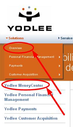
17. Not all of the breadcrumbs are right. For example, on this page, it should be ‘home > company > news > press releases’, but the ‘news >’ step is missing.
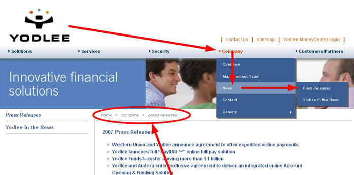
18. This one seems like it should be ‘home > company > careers > jobs’. (missing ‘jobs’)
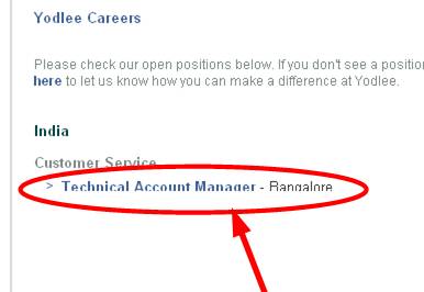
19. There is some bug here. The bottom of the job opening is cut off.
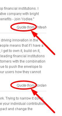
20. The words “Quote from” are unnecessary here. It might be helpful to add the person’s position after their name.
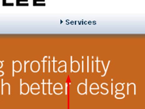
21. There’s too much space after the ‘a’ in the ‘profitability’.
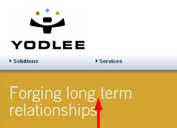
22. The phrase ‘long term’, as it is used here (as an adjective), should have a hyphen.
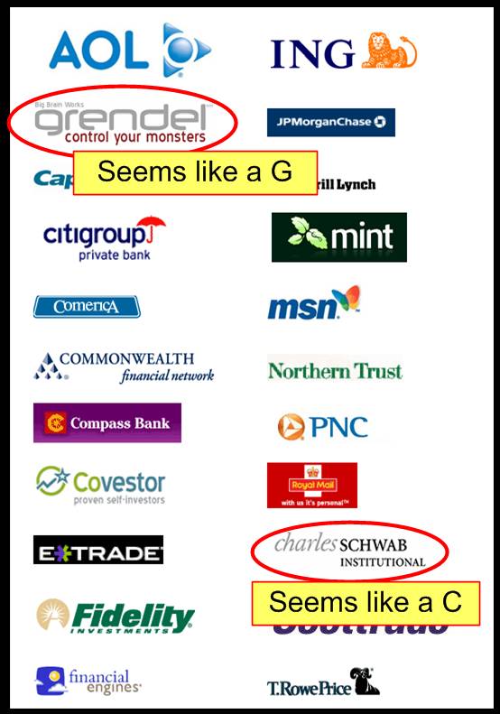
23. This list of customers is more or less alphabetical but two of them seem to be out of order. Charles Schwab is not alphabetized under C but is alphabetized under S instead. Perhaps this is because Schwab is the last name, but T.RowePrice was founded by Thomas Rowe Price, Jr., and T.RowePrice is alphabetized under T, not P for the last name Price. This should be made consistent.
24. Here the quoted person’s name is too close to the quote.
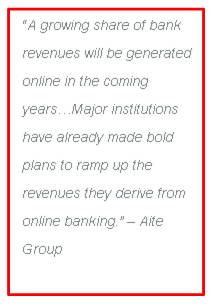
I would change it to this:

or this:

25. Currently the user must hover over the word to follow the link, and the word is sometimes a small target.
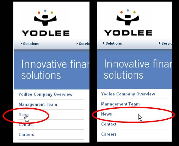
I suggest making the target bigger, allowing the user to click on the link if they are anywhere over the rectangular area that contains the word.
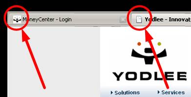
26. There is no favicon on the new site.
