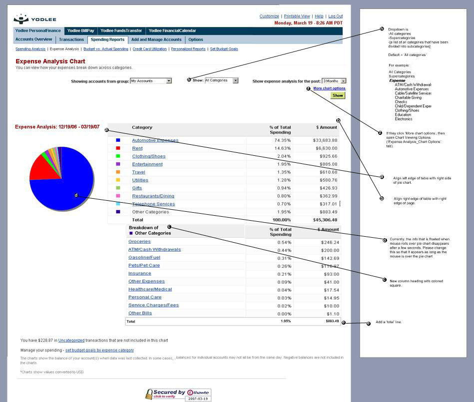
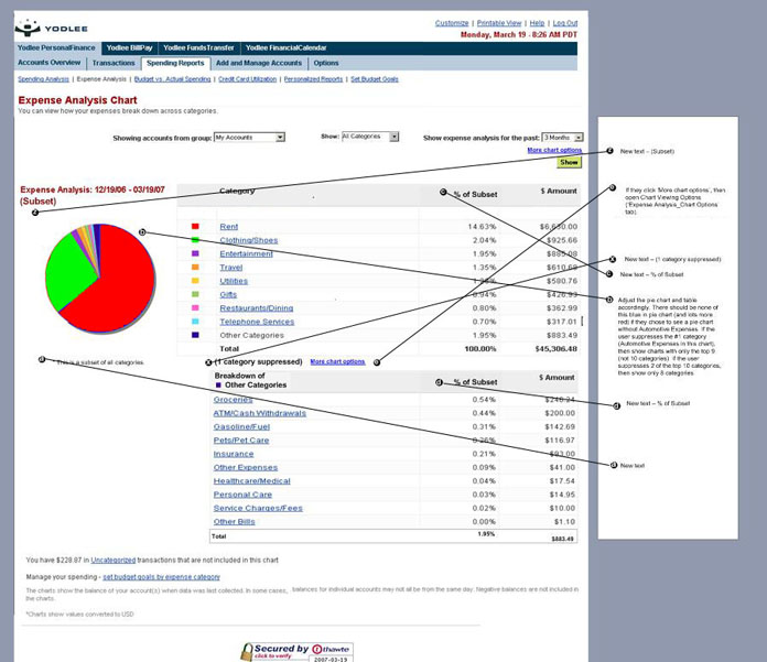
Wireframes of “Exclude Categories” Page
Yodlee’s existing functionality showed the user her expenses in a pie chart and Yodlee was building the new feature of allowing the user to suppress categories from this chart. For example, the user might want to see a pie chart of her spending habits without her mortgage in the equation.
I had to decide was what should happen to the colors of the pie chart when a category was supressed. For example, if the #1 expense was the mortgage, represented as the blue section on the pie chart, and the #2 expense was home maintenance, represented as the red section on the pie chart, what should happen if the user suppresses the #1 category (mortgage)? Should home maintenance, the new #1 expense, become blue, or should it remain red? Will it be confusing if it becomes blue? Also, should we always show ten categories, or if they suppress one, should we show only nine?
I ended up recommending that the #2 category home maintenance should remain its original color (red) for a more consistent experience, and that if Yodlee wanted to always show ten categories that the colors of the new categories be introduced with their own unique colors. For example, if the #11 category comes on to the chart because the #1 category has been supressed, then the #11 category should be a color that we haven’t seen before, because it’s a category that we haven't seen before.

